

Okay, for Free-for-All Friday I tried to get my adult daughter who came in to Missouri yesterday to do a little self-portrait for fun and then I was going to post it as part of ffa-friday. Well, she wasn't too keen on the idea and being an adult and lawyer she effectively evaded the situation. Kids. So.....
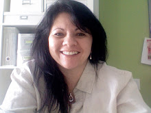
Here is the other project that's been consuming me. The re-do of my website, see the screen grab above of one of the pages. For Free-for-All I would like a critique of my new site. You can comment about anything - images, content, layout, flow, whatever. I promise not to get mad with what you suggest (I am quite familiar with rejection) if you promise not to get mad that I might not use your idea. Fair enough. As always, I value other's opinions so this is a sincere inquiry. Thanks ahead of time.
7 comments:
I like that it has color and I like your photo. It's way cute ;) It looks like it needs something more though. Maybe add another color or some softer lines. Just my ideas
Hmmmmm....
Hmmmmm....
I like the green, the squares and the info they include, that's a great picture of you, I like that you have a self-portrait for your "Artisit" page,I like the fonts and I like the over all simplicity.
It does seem like it needs just a little something. I would think that you wouldn't want a background color, because you don't want it to effect the look of your paintings, but maybe you could do the same green color on the outside columns. A small strip on each side, just enough to add something, but not change the appearance of your paintings.
(Kind of like the picture on your blog. At first it appears your desktop backgorund is part of your website)
I like that green color. I also like that picture of you. I don't really like the squares that are close to your picture though. But thats just what I think.
Thanks everyone for taking the time to look through the site and sharing what you think. I'm thinking about it and looking things over.
I don't know. I really like the title look on your current blog. I think it might be because I'm into the neutral, natural tones right now. I like how you have the picture on the right hand side of your title and how the colors are easy on the eyes. However on your new blog I like the new portrait picture of you and the flow of the page. It looks like it might be easy to navigate through your blog utilizing the squares.
Post a Comment